I have been building websites since 1999 and thus my first designs included a lot of layout tables with spacer gifs. Over the years, CSS became more prominent and powerful but often it was still hacky to create interesting layouts. We used floats for positioning, which were created for something different, too, we used all sorts of creative solutions. More complex layouts required JavaScript for positioning, timing, animation.
Things changed fundamentally with the creation of CSS Flexbox and CSS Grid which finally gave us freedom to design in space. Oh boy, how I love CSS Grid! But while working on our form components, I noticed how hard it can be to overcome your muscle memory and to not fall back into old habits:
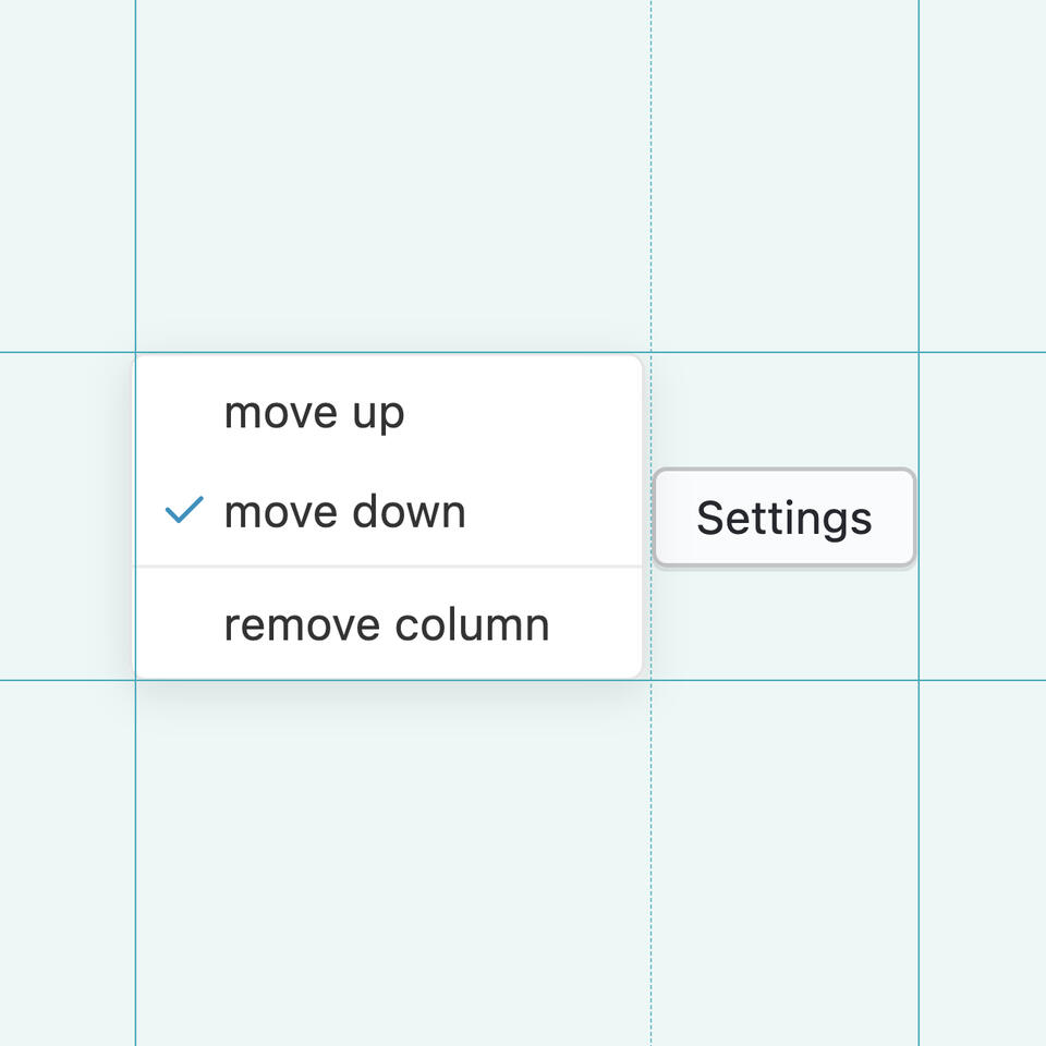
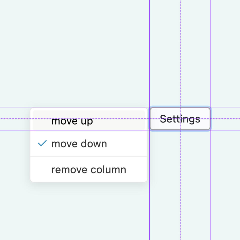
I wanted to build a menu component where the menu opens by clicking on a button and expands in either of the four cardinal directions, aligning itself to the start, center or end of the related axis. I first thought this would be very complicated, involving a lot of math to correctly position the menu. Checking existing libraries seemed to comfirm this as they relied on a lot of JavaScript with absolute positioning and complex distance calculations.
This felt wrong, because one of the strengths of CSS Flexbox and Grid is their ability to do complex calculations for us. They allow for easy alignment and justification (even element centering, my old web veterans!) which is exactly what I was looking for. After a bit of thinking, I found a surprisingly easy solution to my problem: zero space grid cells combined with smart overflow handling.
The invisible grid
To position the menu anywhere I wanted, I needed a three by three grid with the button in the middle and the menu in one of the outer cells, depending on the required placement and alignment:
.wrapper {
    grid-template-columns: min-content min-content min-content;
    grid-template-rows: min-content min-content min-content;
}
button {
    grid-column-start: 2;
    grid-row-start: 2;
}
menu {
    /* placed below, aligned to the left */
    grid-column-start: 2;
    grid-row-start: 3;
    justify-self: start;
    align-self: start;
}
While this setup works great with the menu closed, the cells holding the menu start to expand to the size of said menu when it gets opened and the whole page layout starts to shuffle. Instead of this, we need the menu to float above the other content which is usually solved by absolutely positioning the menu in relation to the wrapper. Thus requiring script-based position calculation.

min-content, the browser will recalculate the cell width when opening the menu causing the layout to “jump”.The great thing about CSS Grid is: it allows for overflowing content, by setting the outer cells’ size to 0. This makes the menu float above the outer content:
.wrapper {
    grid-template-columns: 0 min-content 0;
    grid-template-rows: 0 min-content 0;
}
button {
    grid-column-start: 2;
    grid-row-start: 2;
}
menu {
    /* placed below, aligned to the left */
    grid-column-start: 2;
    grid-row-start: 3;
    justify-self: start;
    align-self: start;
}
Setting this up without absolute positioning, relying purely on standard CSS Grid aligment and justifications opens the way for an additional feature: applying position: sticky; to the menu. This will neatly stop the menu from exiting the screen on scroll before the button does.
menu {
    /* placed below, aligned to the left */
    grid-column-start: 2;
    grid-row-start: 3;
    justify-self: start;
    align-self: start;
    /* stick to the next scrollable parent */
    position: sticky;
    top: 0;
    left: 0;
    right: 0;
    bottom: 0;
}
The button, the menu and the need for ghost cells
This concept worked very well for the cells that did not share space with the menu button and I was very happy with the solution until I noticed that be page began to jump when opening the menu centered to the button. While the outer grid cells could shrink to zero space easily because they were not competing with any other element, the center cells were still set to min-content and thus in conflict with the button size. The browser recalculated the grid sizes when opening the menu which was then no longer floating on top of the page content.
This conflict seemed unsolvable until I noticed that there was a way to apply min-content and 0 width to the button at the same time by dividing it into multiple cells:
.wrapper {
  grid-template-columns: 0 min-content 0 min-content 0;
  grid-template-rows: 0 min-content 0 min-content 0;
}
button {
  grid-column: 2 / -2;
  grid-row: 2 / -2;
  align-self: center;
  justify-self: center;
}
Now, we have a five by five grid with the zero width cells reserved for the menu and the button streching across the centered „ghost“ cells.
Demo
http://labor.hananils.de/menu/index.htm
Of course, this is not everything needed for a working menu. There is JavaScript required to toggle the menu and to make sure everything is accessible, including keyboard navigation. But it’s a great start and a good example how modern CSS techniques can help us solve complex layout tasks without overcomplicating things. And that we should regularly rethink how we solve our web layout ideas.