We set three goals for the redesign of our website:
- Content of our existing sites – the studio website and our dated blogs – should be merged when applicable.
- Texts and language should be clearer and more concise, services described more thoroughly.
- Editing and adding content should become easier. Our existing site was a smart static one-pager that turned out to be too inflexible in this regard.
Design process

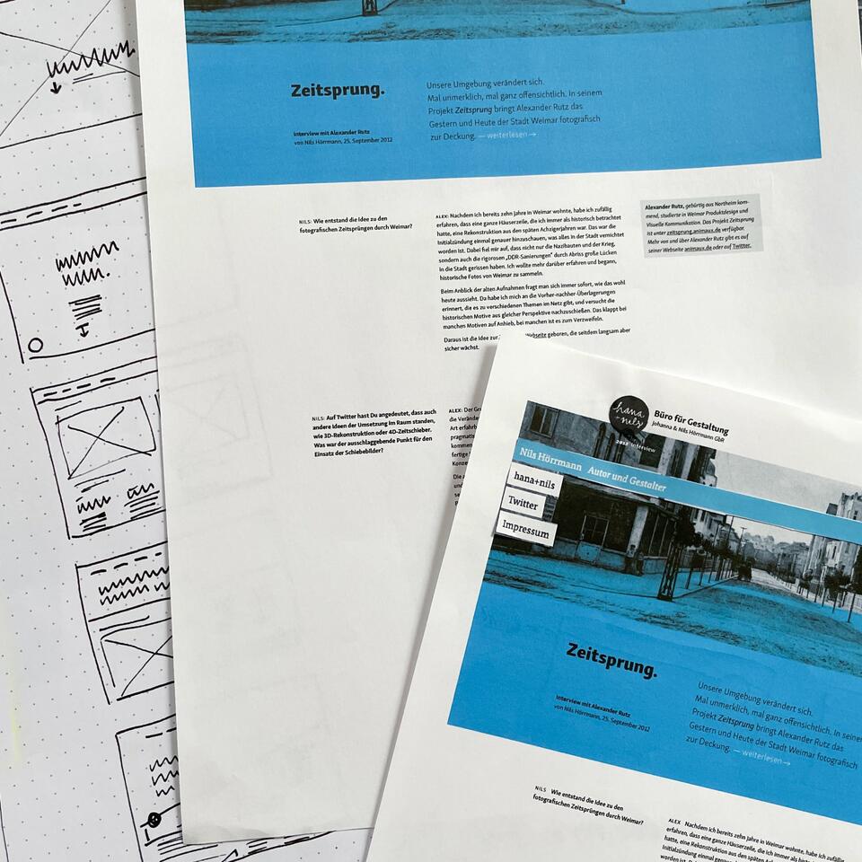
When working on the overall design concept, it was essential to us to create general constrains. Therefore, we started a twofold process of gathering ideas: First, we looked at design elements within our existing sites which we wanted to move to the new site. Second, we collected layout ideas that could be implemented with CSS Grid1 and Flexbox, allowing us to make use of space. In this matter, editorial design found in print magazines was our main inspiration.
1 CSS Grid layouts are a milestone in web design. Background information and examples are provided on Jen Simmons’ site and on Grid by Example by Rachel Andrew.
Our old blogs, formerly residing at johannahoerrmann.de and nilshoerrmann.de, made use of a twin layout that differed in its respective color scheme. The navigation featured an amplitude-like animation on interaction with a pointer device.

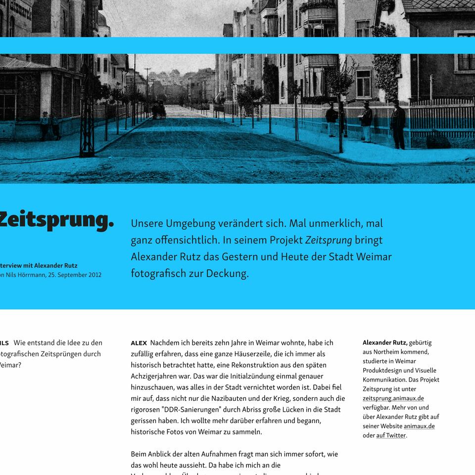
When trying to transfer this element to our new design concept, we repeatedly ran into the issue of the amplitude covering up too much content information within the image. After many variations, this element developed into a fixed header without animation, keeping the playful language switcher as a reference to the former design.
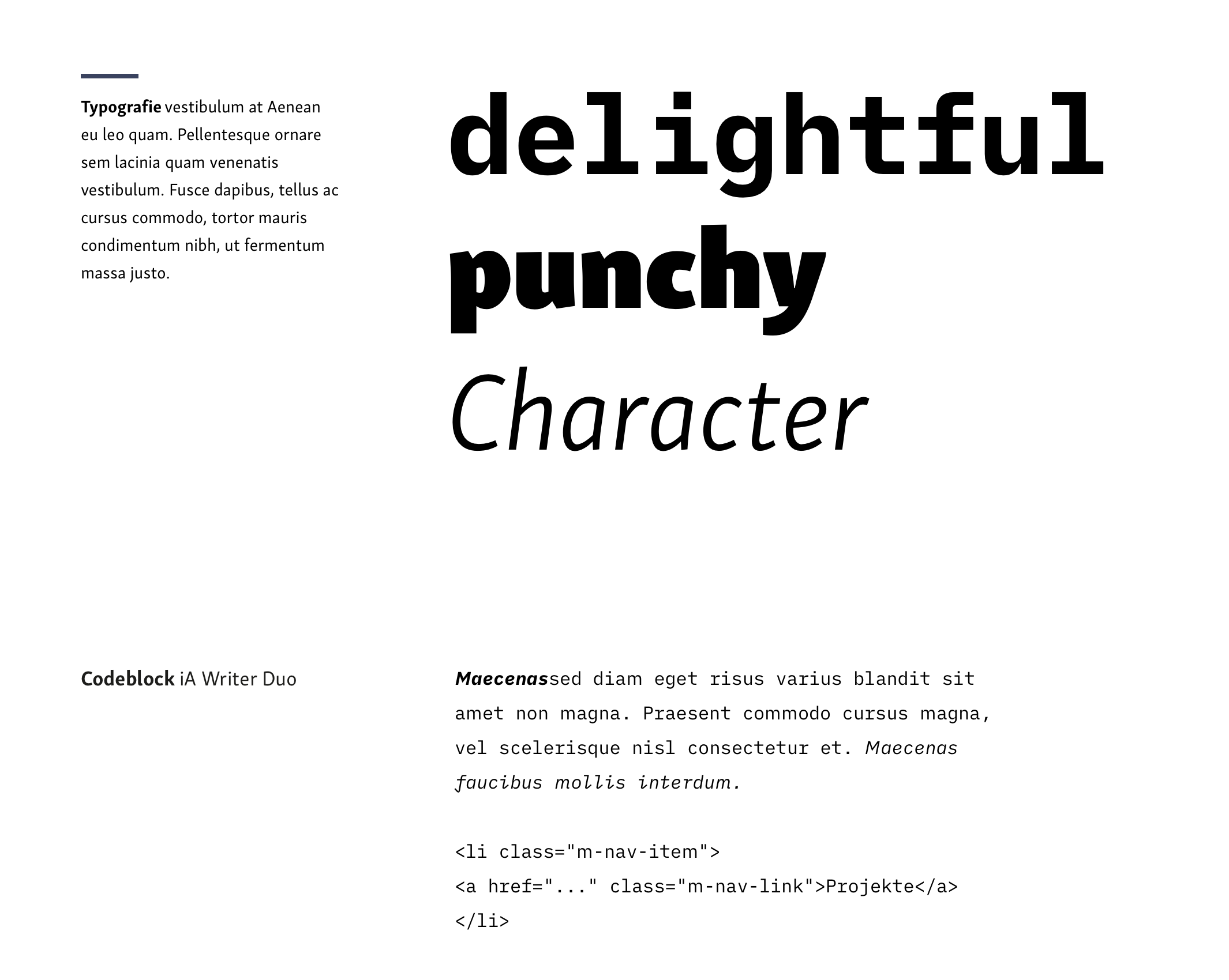
Regarding the new website typography, we opted for a change: Having used “FF Tisa” by Mitja Miklavčič (Fontshop) on the web since establishing our studio, we switched to “Skolar Sans” by David Březina and Sláva Jevčinová (Rosetta) as our new main typeface. As an addition, we brought in “iA Writer Duo” by iA, a variant of “IBM Plex”, for data-like content.
Implementation

When we started working on our site’s new design, we were already in the process of transitioning client projects to a new content management system. After having successfully used Symphony for years, the system’s development stagnated. Therefore, the development of Kirby 3 caught our interest. Foremost, because the system focusses on concepts that are essential to us: content structures and input fields can be designed freely, there are no restrictions with regard to the general site organisation. This flexibility is reflected by the front-end, posing no constraints for markup output.

A big plus offered by Kirby was storing content in text files on the server. This proved to be a real simplification in comparison to database systems, where content is stored abstractly. Text files can be opened, edited and moved on every computer – with no special knowledge or apps required. The abbility to adjust files by search and replace was especially helpful in the context of moving and updating existing content.
The one thing that made switching systems hard was templating. Kirby templates use a mix of PHP and HTML, which was contrary to the clear separation of concerns we knew from using XSLT in Symphony. Kirby’s templating system offers a wide range of possibilities as soon as you get into it, but it still is a complexity factor for us.
Conclusion
For us, moving to Kirby has proven to be a good decision. It’s a fast, flexible and versatile system that can be used for small and large sites alike and is in continuous development. The developer team and the open community excel by their friendlyness and cooperativeness, which really helped us make the switch.2. With the site now running on Kirby, we reached our goal of making our content easier to maintain.
2 Newbies should have a look at Kirbycasts or ask questions in the forum and on the Discord chat.
With regards to content, the design process of our website provided clarity. Further ideas to develop the site have been sketched, but not implemented yet – be it detailed case studies or the introduction of link collection and recommendations.
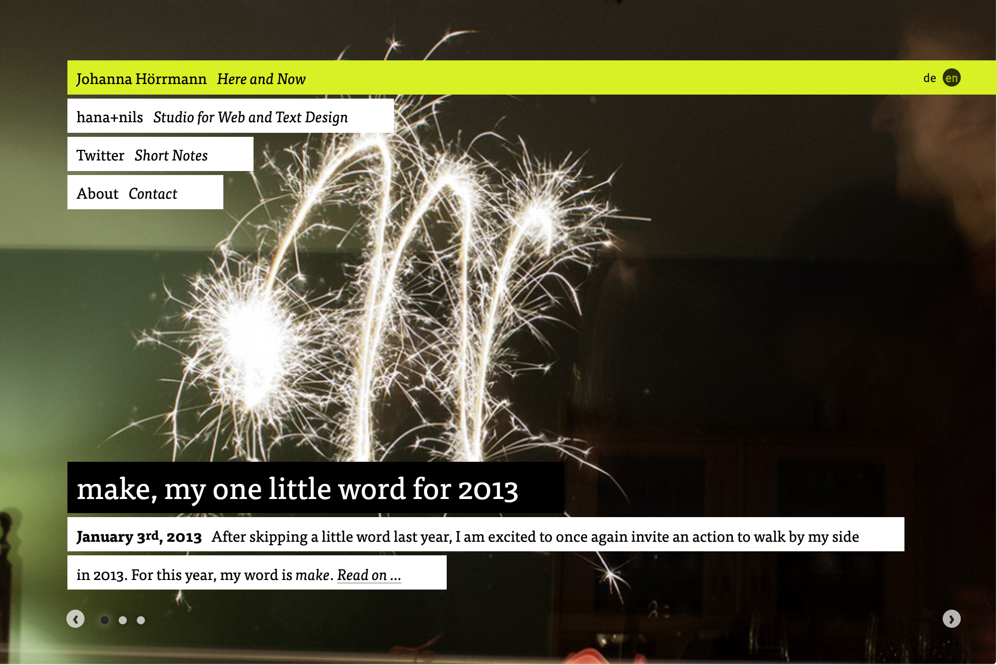
Our goal is to incrementally extend our site and, especially, to get back into the flow of writing and publishing regularly. Now to decide what idea to pick up first … let’s just hire ourselves again and plot a plan.