

TV hadn’t impressed me in a while and so it was pure luck that I discovered German broadcaster Das Erste would air the “acclaimed BBC series” Sherlock that one evening. Lucky me!
Until then, I hadn’t heard of this new adaptation of Sir Arthur Conan Doyle’s classic stories, but my silent love for British humour and British crime series made me curious. It was a fascinating experience: not only does the BBC bring Arthur Conan Doyles stories to the present, they also impress with a special kind of story-telling that combines visual and textual language.
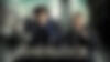
All modernisations are done casually. I don’t know how hardcore fans of Sherlock Holmes might feel about it, but for me, the series is a real break with the clichee of Holmes as we know him. Nicotine patches instead of pipes, taxis and busses instaed of historic, Victorian London. City lights, a metropolis’ glass fronts – all this is a step forward: now, it seems to be just a crime series like any other – besides the fact that no one is amused that there is a Sherlock Holmes and a Doctor Watson.
What makes Sherlock special, is the introduction of an additional layer: deductions, text messages and websites overlay the acting as accompaning story. As if it was the most normal thing in the world, the audience is expected to make a connection between text messages appearing on the wall behind John Watson or weather broadcasts Sherlock is browsing with gestures on his smartphone. Text and image form a unit, no annoying counter-cuts with close-ups of mobile phones or computers needed.1 This combination of textual and visual layers creates very close and special television aesthetics, keeping the narrative pace high.2 This way, action and thought of the main characters coincide for the audience.3
1 As refreshing the text overlays may look, as shocking are the computer interfaces shown on screen. Their designs look like from the year dot. You get the references: Mephone instead of Mobile Me – but why didn’t they take visual inspiration as well?
2 The continuous cutting with its fadings and insertions supports the story’s tempo. And the very modern, cinematic music gives it an additional drive.
3 It must have been a long, creative process to create the series’ styles as you can see when watching the unaired pilot that comes with the first series’ DVD: it give a surprisigly open and honest insight on how things evolved.
Even if the audio commentary of the DVD suggests something else, this has been done before. MK12 used this method in Hollywood movie “Stranger than fiction” to visualise Harold Crick’s world of facts and figures:
Nevertheless, the way Sherlock makes use of this technique is felicitous as it’s not just a purely visual effect but an essential part of the story.
Switching fonts in German
There is an interesting detail regarding the German version of the series: the fonts used for text overlays have been replaced and unified. While the original series makes use of AF Generation Z and P22 London Underground,4 the German version uses FF Officina nearly exclusively. An exception are translations of blog entries that are shown directly on laptops on screen in the original version.
Personally, I have to admit that I prefer the typography of the German version – it looks more precise and balanced. But it changes the content’s connotation. Not in the sense that the German translations are wrong, no, but regarding the associations around the fonts in use.
The original makes two statements: on the one hand, AF Generation Z connects to the internet generation with its mobile phones and devices, on the other hand P22 London Underground sets a clearly British exclamation mark. Both fonts fit the series because they underline the aspects of modernisation as well as the affiliation of the main characters to the City of London.
The German version excludes the British aspects completely and chooses a font that connects to the times before mass distribution of mobile phones and the internet. In different context, Erik Spiekermann, designer of FF Officina, wrote on his blog:
After all, when Officina was designed in the late 80s, it was meant to be used in correspondence, to replace typewriter type. It subsequently shares quite a few of those characteristics.
It would be interesting to know for which reasons fonts have been replaced in the German adaption. Coincidence or concept? I can only guess.
To be continued
These days, the second series started in the UK – German TV will broadcast it this summer. Meanwhile, you can have a look at Sherlockology, a fan site adicted to Sherlock, gathering facts and figures around the world’s only “consulting detective”.